Design trends come and go but great design is always easy to recognize. Print work that catches your eye and naturally intuitive interfaces will always be in demand.
But how you create these products can change based on each project’s needs and the current design trends. Right now we see a bit push towards minimalism on mobile and web interfaces. These minimalist layouts focus on simplicity and user experience over glossy icons and 3D gradients.
But what does this shift look like? And how can designers create simple interfaces that also work well for each project? I’d like to share my thoughts on the matter along with some examples and tips for the future.
How Simplicity Improves UX
A great user experience doesn’t require simple aesthetics. It does require clarity and user intention, but the design can follow any style and still work well.
The big push behind minimalism is that it’s easy for any designer regardless of skillset to create create amazing interfaces. You don’t need to master repeating textures, custom text effects, or detailed icons to make a simple interface that serves the user.
But this doesn’t mean icons and patterns can’t improve a design. Rather these should enhance the design and be used as extras to draw the user’s eye through the page.
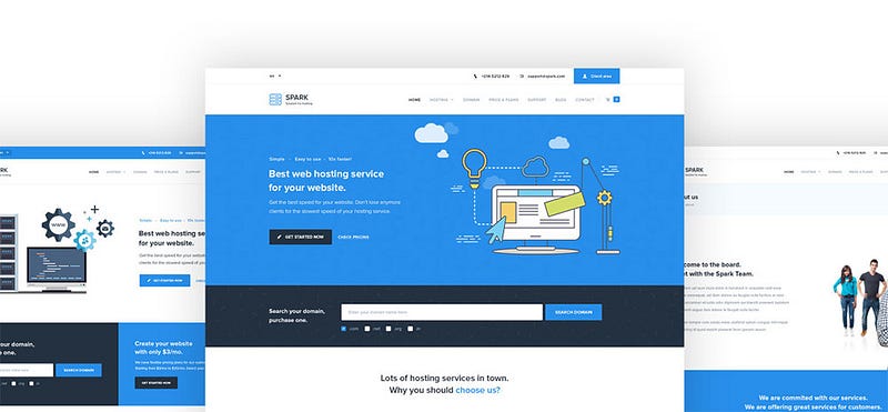
Take a look at the Spark template and how it uses minimalism. It has a very simple color scheme, no gradients, and the vector illustration in the header is completely flat.
Many of the inner pages are also full of custom icon designs. But they all rely on simplicity to blend naturally into the design.
If users aren’t distracted by shiny graphics and overly-detailed typography they’ll be more invested in the content. This should be your ultimate goal to keep visitors engaged with the site and easily navigating their way through pages.
By focusing on simplicity first you’ll have a much easier time planning navigation text, placement, and page hierarchy to improve the overall experience. This will always be more important than aesthetics and more designers are coming around to this fact.
Simple Design Elements
Every design project whether print or digital has its own series of elements. These can be typefaces, icons, or effects used to accentuate the page.
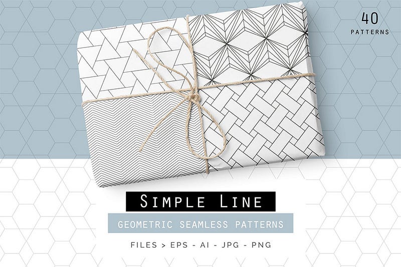
With minimalism quickly becoming the norm these basic design elements are following suit. Most design projects take advantage of minimalist typography like the Ridley Font. Or instead of using a textured background the designer might go with a geometric pattern repeating over a solid color.

These might seem like accessories to the overall design, but the little things add up fast.
These minor accessories actually make the design what it is and really round out the minimalist features.
If you want to design for simplicity then make sure it permeates your entire design. Fonts, icons, colors, and patterns should all feel very simple and approachable. This makes the technical design work a lot easier so you can put more effort into the user experience.
Future Trends in Simplicity
It’s hard to predict the future and nobody can do it with complete accuracy. But based on current trends I think future designers will latch onto minimalism and simple design aesthetics for the sake of improved user experience.
We can already see the flat design trend in iOS app interfaces and iOS icons. With Google’s adoption of material design this is likely the future of Android app UIs too.

The web is a different beast altogether but it follows closely with other design trends.
Do I think every website should be flat and simple? No of course not. Different ideas work better with different projects and diversity only improves the design world.
But there’s something to be said about minimalism and flat design because these styles help designers focus on the experience first. It’s easy to get lost creating beautifully polished icons and vectors, and in the process you can lose sight of the bigger picture.
So the future may hold a lot of simpler designs and minimalist interfaces. But it also holds a much greater focus on great user experience using flat/material design as a visual language for each project.
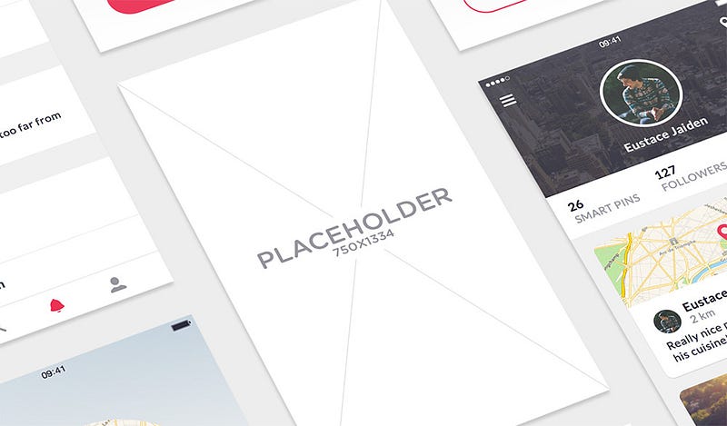
This is true of typography and web/mobile mockups along with all other related design elements.

And since minimalism is so easy to create, it won’t take as much time to polish an interface. Designers can focus more on the experience and put their energy towards creating an interface that’s intuitive and easy to use.
Wrapping Up
Whether you’re an experienced designer or just getting into the industry you can look forward to a lot of minimalist design work. The best projects understand which aesthetics work best and implement a great user experience around those design ideas.
But if you’re ever struggling with an idea then minimalism is usually a safe bet. It keeps users engaged with the interface and places focus right where it belongs: on the content.
And it’s for this reason I think minimalism and simplicity will usher in a new era of user-focused design for every single project. Instead of designers obsessing over aesthetics they can instead focus on content, engagement, and the overall user experience for every project.
